Which are the colours and colour combinations that distinguish the Swiss style?
This article was revised and refreshed on 10/03/20.
More than a simple question, it’s an aesthetic challenge that Fabian Burghardt took up while a design student in Berlin. His answer was to create the (unfortunately now defunct) “Swiss Style Color Picker”.
Dedicated to graphic designers looking for inspiration, the website offered a wide range of colour combinations faithfully inspired by the famous posters of the Swiss school established in the 50s.
Fabian, how did you come up with this idea?
Fabian Burghardt: During a university lab my school mates and I were working on the creation of an experimental video magazine. One of us interpreted this project in Swiss-style: I was struck by the power of the colour combinations and by the formal rigor typical of this style. I then decided to create a digital tool that could inspire other designers like myself.
The website looks like an interactive poster. What do people think?
Fabian Burghardt: About 100.000 site views in one month and a lot of nice blog posts and e-mails show me that there is a really important symbiosis in the whole designer web community.
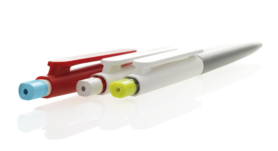
We were pleased to notice a certain affinity with the DS9 colour range, the new Prodir pen. We consider it as a confirmation of our Swissness.

Fabian Burghardt: Absolutely. And I am not surprised since it is a Swiss product: the minimalist design and the bright range of colours are a real proof. Among other things I appreciate the shades of green and grey which are typical of the International Style that originated in Switzerland. I was pleasantly impressed by your communication: I really like the product images and the font that you used for your blog: Avenir, my favourite!
Thanks Fabian! Nice meeting you and good luck.

Left: Josef Müller-Brockmann, Der Film, 1960 – Zürich Museum of Arts
Center: Wim Crouwel, Eugène Brands, 1969 – NL Graphic Design, Amsterdam
Right: Jacqueline Casey, Boston Visual Artists Union, 1973 – MIT Museum, Cambridge
The Swiss Style
The Swiss style, also known as International Typographic Style, is a graphic art movement asserted in Switzerland after World War II and later on adopted by worldwide designers.
Its principles emphasise clean lines, balance amongst forms and readability. These results are pursued thanks to graphic cages that define asymmetrical layouts, sans serif typefaces, strict geometrical forms and the use of photography over illustration. Leading figures include Müller-Brockmann, Theo Ballmer, Max Bill and the designer of the most widespread typeface so called Helvetica Max Miedinger. Many designers, including the Italian Massimo Vignelli who has significantly contributed to make it famous, have systematically adopted the font created in 1957.
The Swiss Style continues nowadays to exert a strong influence in graphic design, both off- and online.
